

Designing with confidence: Navigating product development timelines as a designer
In the world of product design, designers are faced with the challenge – and the opportunity – of balancing competing priorities and timelines in the quest to improve experiences for our customers. While we must design for the short-term with, say, an immediate quarterly roadmap in mind, we also have to keep our eyes on the big picture.
As a senior product designer at Practice Fusion, an electronic health record (EHR) company, I work with a team of people to design an EHR that enables independent healthcare practices to deliver great care to their patients and support the day-to-day needs of their businesses. While my experience may be very specific to health IT design, many of the lessons I have learned represent universal challenges that other product designers face within their own organizations.
One key question I grapple with in our work is this:
How do we tackle the problems of now while also mapping the future of where we want to go?

These two paths often feel competing and divergent. However, there are many ways that designers can leverage these different timelines and priorities to confidently design better solutions for our customers. We can and should use our superpowers to investigate current problems and plan for the future so we can recognize and seize opportunities to enact change.
When time is (and isn’t) on your side
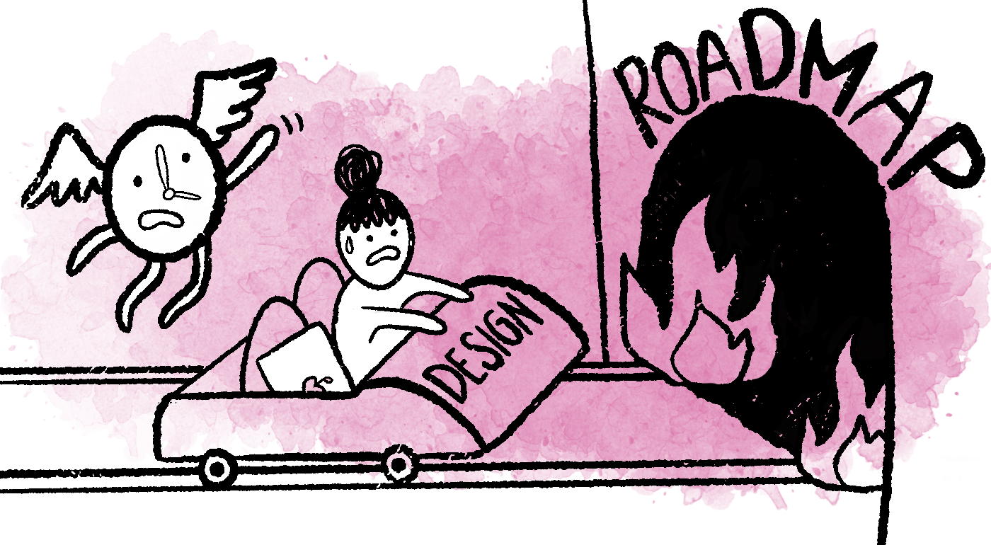
When you’re working on roadmap items, you never have enough time to do everything you want. These projects move fast and can feel like a moving target at times. Sometimes the pace can feel frantic and that I’m designing reactively with no time to consider all the things a designer should. I need to balance best practice design with user feedback and business objectives – a task that can be daunting. In the context of designing for health IT, this is compounded by the unique challenges inherent in the field, including government regulations, HIPAA and other privacy concerns, legal considerations, and contract agreements. I try to always make improvements for our customers however and wherever I can, no matter what I’m working on, celebrating even the smallest victories. It can be frustrating, though, when it feels like I’m merely chipping away at problems rather than making great strides in improvement.
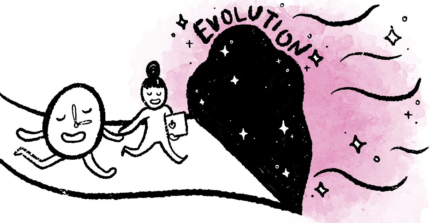
With product evolution initiatives, however, time is on your side. These projects are largely driven by design and user research and have the luxury of no looming deadlines or demands from other parts of the organization. I have ample time to investigate user problems with a feature and carefully consider what’s needed to improve it from the ground up. It’s aspirational work to dive into what the next version or ideal version of our product could look like with time to investigate, explore, design, test, and plan in anticipation of finding just the right timing to get it built. This kind of design serves to increase my confidence in the work I produce. It allows me to gain insight from our customers and ponder improvements within the context of best practices and the overall design system. However, these design-led initiatives can be difficult to garner support for and push forward when they don’t necessarily map directly to other, more pressing business goals and company objects. Evolution design work can feel a bit futile when it’s quite probable that the work that may never see the light of day.
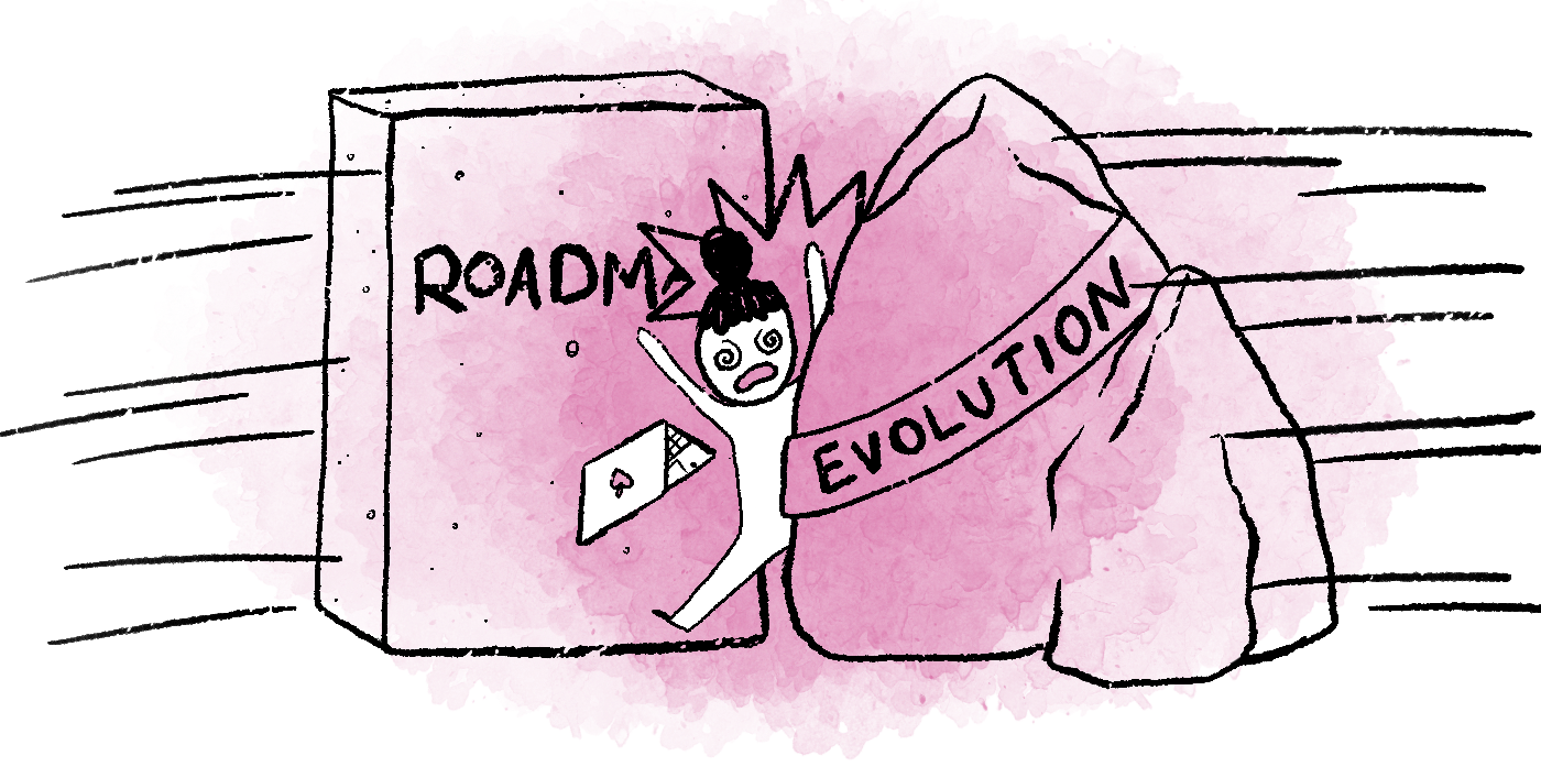
These two situations are far ends of a continuum that we all struggle with as product designers. It can feel like you’re trapped between a fast-paced hellscape and deep time pools, depending on which end of that spectrum you find yourself working. Every product needs both to succeed, though. It’s critical that design teams work across their companies to think not just about the near-term needs of a roadmap but also the long-term vision for a future state.
So, how do you push forward a vision of your product’s future within a landscape of so many competing priorities?
I learned many lessons about how to do this successfully through a major overhaul of one of our product’s key feature areas – the Patient Summary. This design-led initiative was a huge win for our team, our EHR, our customers, their patients, and my confidence.
Reimagining our Patient Summary
The last major design overhaul of our EHR happened in 2013. We made a major technology transition from Adobe Flex to HTML5 which required an entirely new process of designing and building software, and a wholly new design system. Four years later, in 2017, we’d lived with that design system long enough to see its limitations and recognize that we needed to take steps to evolve it.
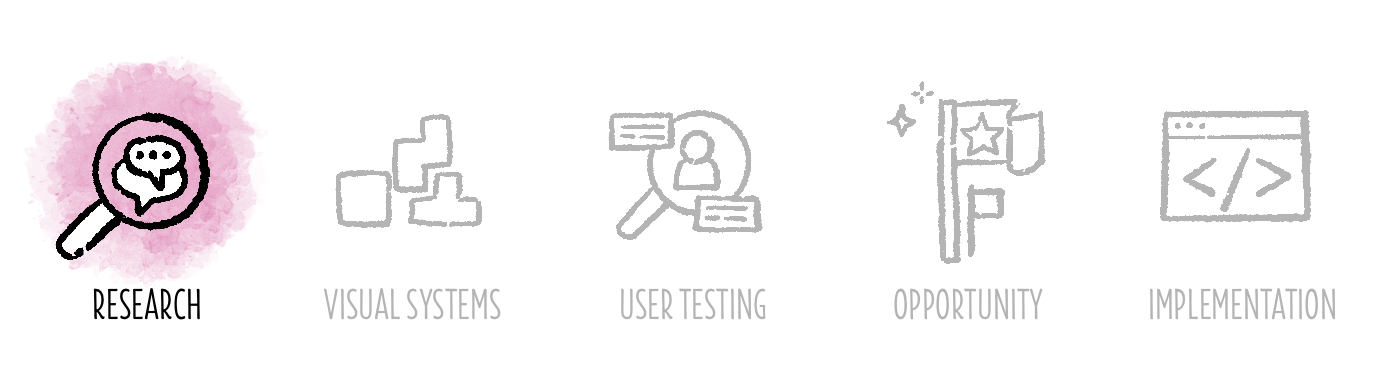
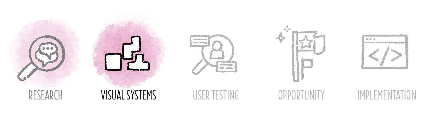
Together as a design team, we established a design vision and a set of key design principles – simple, focused, trusted – to guide us as we embarked on the long road of evolving our EHR. We first identified the five most valuable areas of our product and established workstreams within the design team to explore evolutions of those areas and, by extension, our entire EHR.
The Patient Summary surfaced as the most viable area to tackle first. Not only is it the most highly utilized part of a patient’s medical chart, it is relatively self-contained and could act as the first touchpoint in building a strong foundation for an overall product evolution.
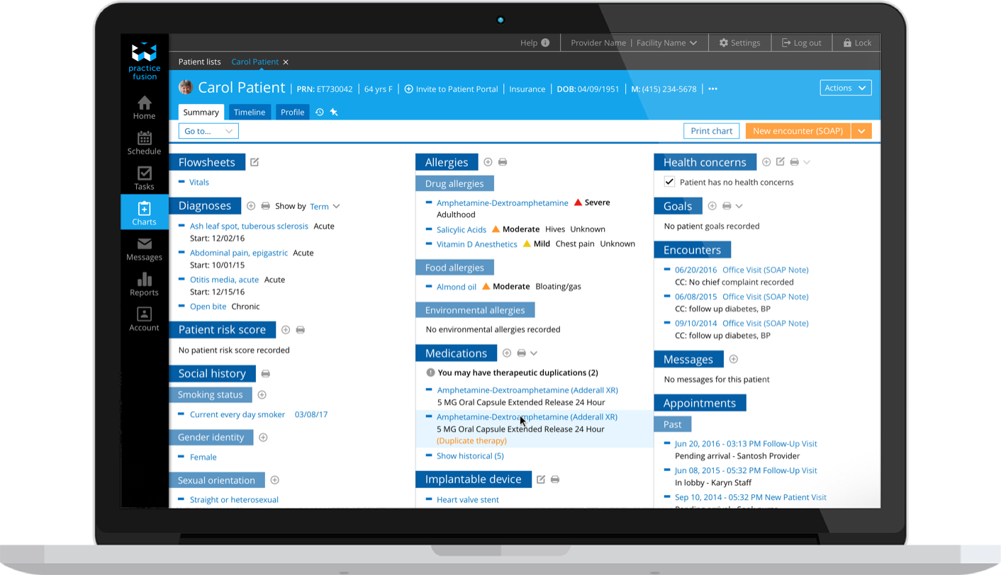
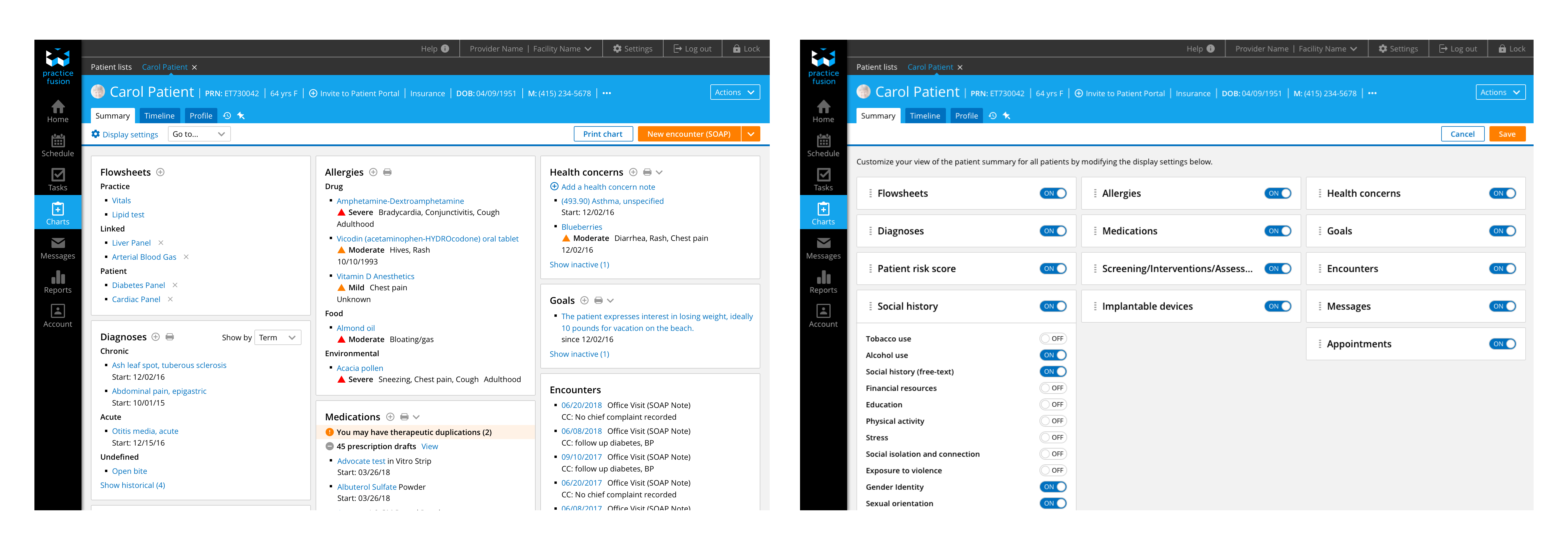
The Patient Summary aggregates current and historical clinical patient data, and provides a central location to add, review, and edit information such as: medications, diagnoses, social history, and allergies. It’s a key place to see a snapshot of a given patient, but its visual design, information architecture, interaction patterns, and inconsistencies in data display were limiting its usefulness and slowing our customers down in their day-to-day workflows.
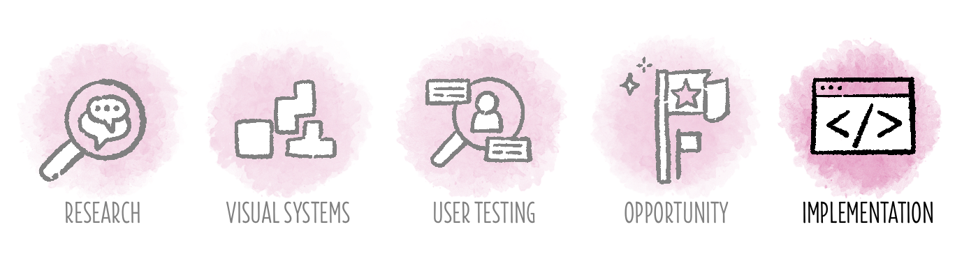
While there wasn’t necessarily room on our roadmap to tackle this work, we knew we had to address the Patient Summary if we were going to move anything forward in our EHR design. So, I took the lead in mapping out a feature redesign plan with an eye towards building support for the work across many stakeholders, and dovetailing it with roadmap work wherever possible. Here’s what I did:
Step 1: Figure out what you know and what you don’t
I started my journey by combing through user forums and talking with our customer service teams to assess known problems with the Patient Summary. Our customers were frustrated by the lack of customization; difficulty of parsing tons of information on a long scrolling screen; and missing sections of patient information, such as immunizations and health screenings.
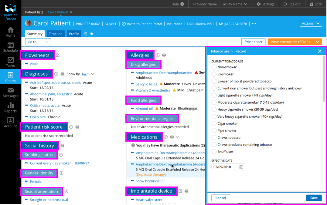
I identified additional design concerns that included: hierarchy issues; visual styling that impeded information discovery; and inconsistent patterns in data input and editing. The way the Patient Summary was originally designed meant that a healthcare provider might find themselves bouncing from modals to new tabs to entirely different parts of the EHR resulting in a loss of context, disruption in workflow, and obstructed views of information.
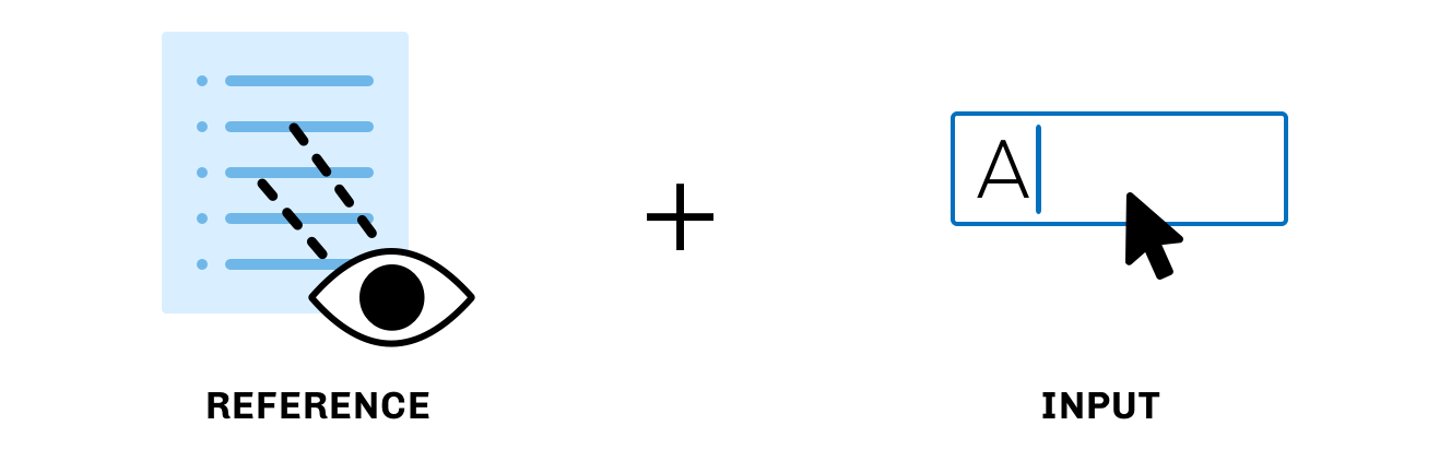
Based on all the data I gathered to that point, I formed a hypothesis about Patient Summary: Customers use the Patient Summary to reference past clinical data while simultaneously inputting new clinical data.
We knew we needed to completely overhaul this design to truly address that customer need, but with a project this massive, it’s sometimes hard to know where to start designing. So, we decided to examine our foundation first.
Step 2: Rework your design system so its in harmony with your evolution
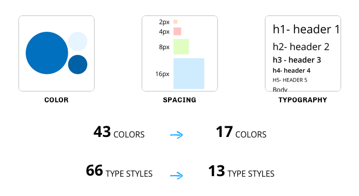
Before we could make progress on anything related to the Patient Summary, we had to start with our design system. We desperately needed to bring order and efficiency to the visual design of our product. Over the course of more than a year, we accomplished a three-phase design system overhaul. First, we drastically refined our typography styles, color palette, and spacing rules to create more consistency in the visual language of our product. Next, we developed better tools for the design team to improve consistency and efficiency in designing product features, including a more comprehensive style guide with usage details and a shared symbols library in Sketch.

Finally, we collaborated closely with our platform technology team to improve the reusable component library used by our front-end developers when implementing designs. That process deserves a post of its own, but that’s a story for another time.
Refining our design system made it possible for us to start the Patient Summary redesign from a strong foundation. With tighter rules for typography, color, and spacing, and new components like cards to contain unique sets of information, I finally had a design that was ready for a first round of testing with our customers.
Step 3: Test your designs (and your assumptions) with real people
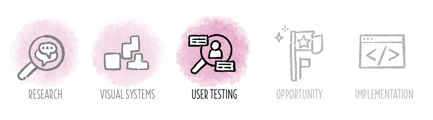
Collaborating with a user researcher, we conducted an initial phase of user testing to confirm I was headed in the right direction. We sought to accomplish two objectives: 1) test the hypothesis that the Patient Summary is used as a reference point and a tool to input and edit data; and 2) gauge users’ reactions to the new layout. We learned that our hypothesis was correct, and we received positive feedback on both the new card-based design and the customization functionality.
After this round of research, we felt like we’d gotten the Patient Summary to a great spot. But, without an opportunity to get it on the roadmap, we were likely going to have to leave it be until that door opened.
But, as they say, where there’s a will there’s a way!
Step 4: Find the opportunity to get your design on the roadmap
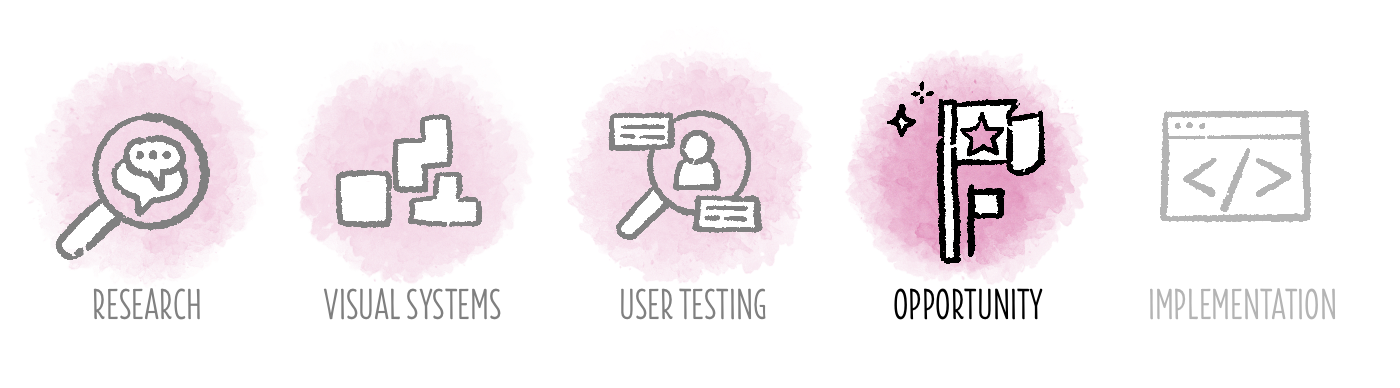
Over the course of our initial stages of the redesign, we became aware of an upcoming regulatory feature that was slated on our roadmap for the coming months. Lucky for us, that feature related to a set of new required structured data fields that needed to be added to the Patient Summary. We seized on this opportunity. We started collaborating with the feature product manager on next steps for the design and worked together to figure out how we could integrate as many design improvements as possible into the roadmap project. We planned a second phase of research to explore our customers’ mental model of those structured data fields. Through a card sort exercise, we identified the best way to categorize and organize those fields, and we gained confidence in where we had landed with the overall redesign.
Step 5: Work closely with your core product team to build the design and measure its success in the wild
Collaborating closely with our engineers, we conducted regular groomings and design reviews to ensure a successful build and release of the redesign. Together, we successfully overhauled our Patient Summary while adding much needed customization functionality along with the new required structured data fields. Since releasing this feature, we’ve seen a high utilization rate of the display settings customization feature and a lot of positive qualitative feedback about the new design relayed by our customer success team. As one provider said:
“This looks more organized, user friendly, and less cluttered with those boxes.”
“The headers are cleaner and look more like other modern applications I’ve seen. I like that.”
“I feel like I can find things faster, which is helpful since we track a very extensive social history.”
How to make your dream a reality
This project was over two years in the making. It takes a lot of collaborating, planning, and doing your best to keep these kinds of initiatives alive. While it can be a long road to evolve your product and make leaps forward to improve user experience, it’s worth sticking with it and getting creative in your approach to find ways to realize your vision.
I’ll leave you with a few hard lessons won in my process:
- Cultivate your own garden. Build the infrastructure of collaboration within your design team, and cultivate relationships between designers along with a vision that you can all get behind and own. Designers need initiative to drive conversations, recruit others to collaborate, and investigate user needs and motivations
- Cultivate shared gardens. Build solid rapport and trust across product development teams, and include a wide range of people in your design conversations. This will build support for your work and inspire cross-team collaboration so everyone feels a sense of ownership over the evolution process.
- Stay aware of where your company is going and its business goals and priorities. When you can demonstrate your understanding of that complex landscape and integrate it into your vision, you build trust and a willingness to collaborate across lots of different disciplines. And remember that even the tiniest sliver of related work can represent a door of opportunity.
- Share your work across your organization. Make visible what you’re working on. You’ll be surprised to see where encouragement and support may come from when you let people in on your vision.